

Stumbled upon from some “user experience” company if I remember correctly; I would point out that their layout is wrong, and the title really should read “NORMAL VS. HAPPY USERS” given the icons below the heading.
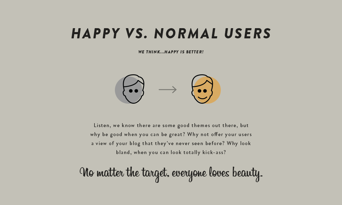


Stumbled upon from some “user experience” company if I remember correctly; I would point out that their layout is wrong, and the title really should read “NORMAL VS. HAPPY USERS” given the icons below the heading.